Welcome To The Wonderful World of
“Mobile-First Shopify Store Design: Elevating The Mobile User Experience”
Hey there, Savvy Shopify owners and Ecom legends! Imagine you are shopping online with your phone, and everything works like magic. And that’s what Mobile-first design does! It’s like keeping priorities of mobile users first, making their experience super smooth and fun. No more tiny buttons or slow loading! With this approach, your Shopify store becomes very easy and quick to buy from. So, let’s make your store a mobile paradise and keep those customers happy!
Understanding Mobile User Behaviour:
To create an awesome mobile shopping experience, we need to understand how people use their phones to shop! So, here is the scoop on Mobile user behaviour: First, check out those key trends and stats. Because they give us valuable insights into what’s hot in the mobile shopping world. Next up, we must identify what mobile users want and expect when they shop on their phones. By knowing this we can get an idea of how to create an awesome mobile-first Shopify store.
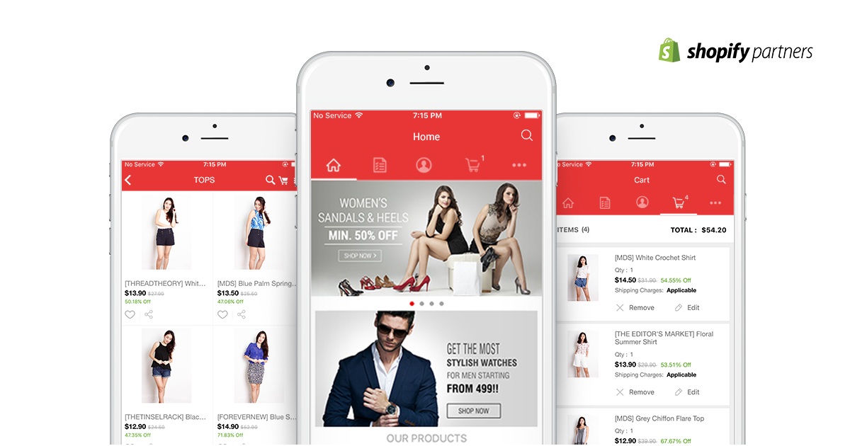
Optimizing Mobile Storefront:
To make your mobile store super awesome, here are few tips and key points to make sure it’s good.
1.Streamlines and Responsive Design: It means creating a clean and user-friendly layout for your mobile storefront. Make sure you avoid clutter and unnecessary elements, so your customers can easily find what they are looking for. And ensure that the design adopts to different screen sizes, making it easy to navigate and interact with on any mobile device.
2.Mobile-friendly Navigation and Design:Simplify your navigation and menus to make it effortless for users to explore your products or services. Use clear and intuitive labels, and consider using mobile-friendly icons for better recognition. Implement a hamburger menu or other mobile-specific navigation patterns to save screen space and improve your user experience.
3.Fast-landing Pages and Performance Optimization: Remember mobile users are on the go, and they will not wait around for slow landing pages. Optimize your website’s performance to ensure speedy landing times. Compress images, cut server requests, and leverage catching to reduce load times. This will not only enhance user satisfaction but also improve your search engine rankings.
Mobile Checkout Experience:
Let’s make checking out on mobile a breeze! Here is how you can do it- First, keep the checkout process simple and hassle-free, so customers can quickly complete their purchase without any fuss. Next up, offer various mobile payment options like digital wallets and one-click payment to give shoppers flexibility and convenience. And finally, reduce cart abandonment with smart mobile strategies, like reminding users of their pending orders, offering discounts, or optimizing the checkout page for spend and ease. With these tweaks, your mobile checkout experience will be so smooth that customers will keep coming back for more!
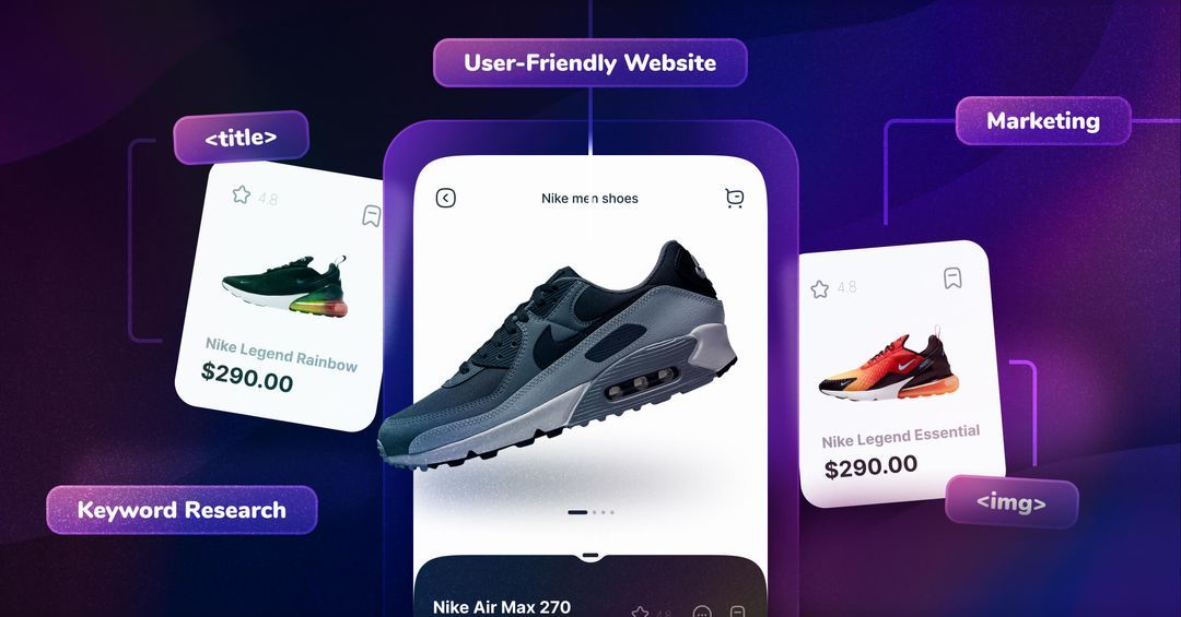
Leveraging Mobile-friendly Content:
When it comes to mobile content is also so crucial! Here is how you can rock it with few quick tips-
Create visual and textual content that’s perfect for mobile screens, keeping it clear and engaging.
Optimize your product images and videos for mobile devices, so they load fast and look fantastic.
Use mobile-specific CTAs and promotions to guide customers to action, like “Shop Now” buttons that are easy to tap.
Mobile SEO and Marketing:
To conquer the mobile world, you must ace your SEO and marketing game. Then you will rock the mobile scene and reach more customers then ever before! Here are few tips for that-
* Nail mobile SEO by using mobile-friendly website designs, optimizing page speed, and focusing on relevant keywords for mobile users.
* Boost your presence with mobile advertising and promotions, reaching out to your target audience through mobile ads and special deals.
* Master Social Media Strategies for mobile engagement, creating captivating content and interactions that keep your audience hooked on their mobile devices.
Testing and Improving Mobile UX:
Want to make your mobile user experience top notch? I mean want to make your Shopify store’s mobile UX shine, and make your customers love every tap and swipe? We got you follow these steps-
1. Study how users behave on your mobile site and listen to their feedback to understand what works and what needs improvement.
2. Conduct A/B testing to optimize your mobile design by comparing different versions and seeing which one performs better with real users.
3. Keep striving for success by continuously improving and refining your mobile experience, making sure it stays user-friendly and engaging.
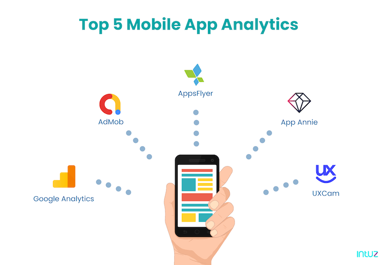
Mobile Analytics and Metrics:
To stay ahead of the game and to know how to fine-tune your mobile strategy and keep delighting your users, you have to master analytics and metrics. We have a few essentials to follow to master them-
1. Tracking Mobile User engagement: Keep a close eye on how your customers engage with your mobile app. Use analytics tools too track metrics like the number of visits, session duration, and the most popular pages. Understanding user behaviour on mobile will help you identify what’s working well and what need to be improved, allowing you to enhance the overall mobile experience.
2. Key Performance Indicators for Mobile Success: Measure your mobile performance with essential KPIs that provide valuable insights into your mobile strategy’s effectiveness. Track conversion rates to see how many users complete desires action, monitor bounce rates to understand if visitors are leaving quickly, and analyze time spent on pages to gauge engagement. These KPIs serve as benchmarks, guiding you towards achieving your mobile goals and driving growth.
3. Tools and Resources for Mobile Analytics: Equip yourself with the right tools and resources to gather and analyze mobile data effectively. Utilize popular analytics tools like Google analytics, Mixpanel, Amplitude, Smartlook, etc., to monitor user behaviour and track mobile performance. These analytics resources empower you with the knowledge needed to make data-driven decisions and optimize your mobile presence.
Conclusion:
Alright Shopify legends, now you are ready to master the mobile-first Shopify store. Remember that it gives you a competitive edge in the world of e-commerce. And crafting a stellar mobile user experience is crucial for keeping customers happy and engaged. So, let’s get ready to rock the mobile bandwagon, and watch your online store thrive with satisfied mobile Shoppers! Happy selling!
Ready to boost engagement & accelerate conversion with your website visitors?
This website uses cookies to improve your experience while you navigate through the website. Out of these, the cookies that are categorized as necessary are stored on your browser as they are essential for the working of basic functionalities of the website. We also use third-party cookies that help us analyze and understand how you use this website. These cookies will be stored in your browser only with your consent. You also have the option to opt-out of these cookies. But opting out of some of these cookies may affect your browsing experience.
Necessary cookies are absolutely essential for the website to function properly. These cookies ensure basic functionalities and security features of the website, anonymously.
Cookie
Duration
Description
cookielawinfo-checbox-analytics
11 months
This cookie is set by GDPR Cookie Consent plugin. The cookie is used to store the user consent for the cookies in the category "Analytics".
cookielawinfo-checbox-functional
11 months
The cookie is set by GDPR cookie consent to record the user consent for the cookies in the category "Functional".
cookielawinfo-checbox-others
11 months
This cookie is set by GDPR Cookie Consent plugin. The cookie is used to store the user consent for the cookies in the category "Other.
cookielawinfo-checkbox-necessary
11 months
This cookie is set by GDPR Cookie Consent plugin. The cookies is used to store the user consent for the cookies in the category "Necessary".
cookielawinfo-checkbox-performance
11 months
This cookie is set by GDPR Cookie Consent plugin. The cookie is used to store the user consent for the cookies in the category "Performance".
viewed_cookie_policy
11 months
The cookie is set by the GDPR Cookie Consent plugin and is used to store whether or not user has consented to the use of cookies. It does not store any personal data.
Functional cookies help to perform certain functionalities like sharing the content of the website on social media platforms, collect feedbacks, and other third-party features.
Performance cookies are used to understand and analyze the key performance indexes of the website which helps in delivering a better user experience for the visitors.
Analytical cookies are used to understand how visitors interact with the website. These cookies help provide information on metrics the number of visitors, bounce rate, traffic source, etc.
Advertisement cookies are used to provide visitors with relevant ads and marketing campaigns. These cookies track visitors across websites and collect information to provide customized ads.